Pantone’s color of the year for 2015 is Marsala, a warm red with brown undertones. Every year, I look forward to finding out the color of the year, and I knew that this year I would explore the color in the form of a quilt. I was even more excited when I heard about the Pantone Quilt Challenge at On the Windy Side and Play Crafts.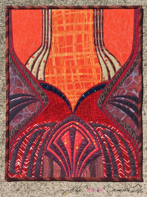
The Pantone website features a quote by their executive director, Leatrice Eiseman, describing marsala as a color which “enriches our mind, body and soul, exuding confidence and stability. Marsala is a subtly seductive shade, one that draws us into its embracing warmth.” The challenge for me was that marsala isn’t a color that I’m particularly drawn to. However, I learned long ago that there is no “ugly” color- it is all in how you use it. I certainly wouldn’t label marsala with the U-word, but it is skating a bit to close too brown for my taste, and so many red-brown fabrics can look depressing or even dead. Fortunately, last fall I picked up several fat quarters of marsala-like fabrics from a clearance bin. Maybe my subconscious is better at picking up color trends than the rest of my brain, but I was sure glad that I had these when the color of the year was announced! I mixed those with a few other marsala-y reds to come up with my basic palette. 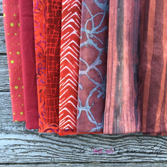
When I am not immediately inspired, I will often do some sort of free writing or word association with the topic or theme. For me marsala is associated with things like wine, curry, tomato sauce, roses, lipstick- sensuality, volume, and curves come to mind. The more I thought about this color, the more I thought that marsala calls out to be used in an Art Nouveau inspired design.
In looking at some Art Nouveau research, I landed on this tile design. For me, the curves of this design seemed to be the perfect match for marsala.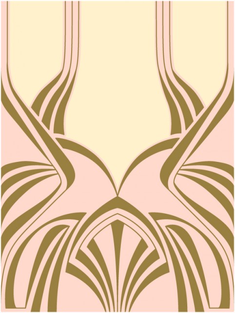
I popped the image into the computer to create three graphics that would help in the creation of this quilt. The first was a line drawing for the main pieces of fabric. I printed this image on freezer paper so I could cut apart the image, iron the pieces to fabric and press the seam allowances around the paper. This allowed me to assemble the quilt top using English Paper Piecing style techniques.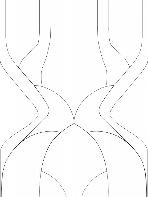
Over the line drawing I added a layer showing the smaller pieces of fabric that I would later add using wonder under. I also printed this off on freezer paper to make it easier to cut these shapes. (Hint: Freezer paper won’t stick well to the paper backing of wonder under. I ironed the wonder under to the back of the fabric and the freezer paper to the front. It was really easy to cut these fairly small shapes, and you could even leave the freezer paper in place to add stability to the fabric after the paper wonder under backing is removed. Once the fabric is ironed in place you can peel back the freezer paper.)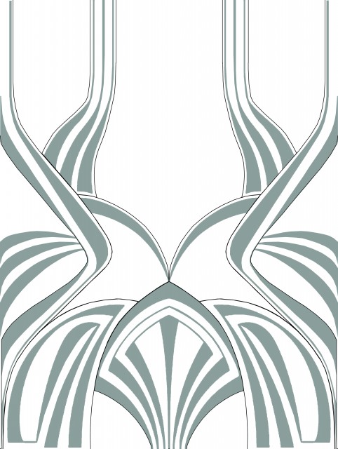
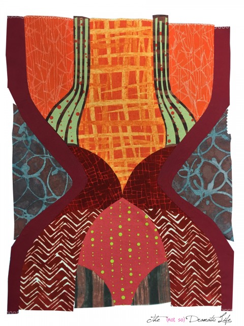
The final graphic I created was a color image which I used to help determine general fabric placement. After quite a bit of experimentation, I decided that marsala paired beautifully with oranges and deep, muted violets, blues, and greys.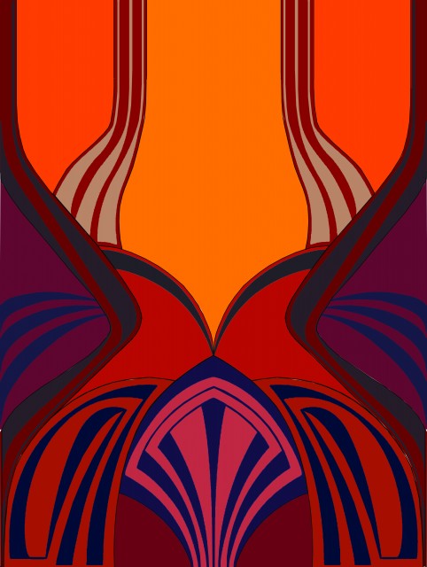
The main construction of the top was done entirely by hand.
Main Marsala top construction with tan appliqués in place
With the main construction complete, I adhered the smaller pieces to the quilt using Wonder Under before using a machine blanket stitch to sew around the edges of the appliqués.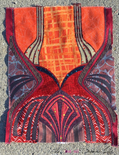
Here is the back view of the quilt top- I just love seeing “behind the scenes” on this sort of construction!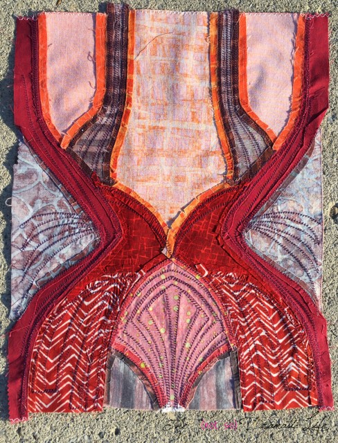
The quilt back is improvisationally pieced using marsala colored fabrics.
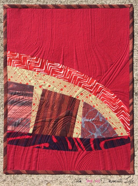
Marsala Mini back view
For the quilting I decided to do fairly heavy quilting echoing each shape in the design.
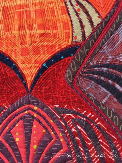
Marsala Mini front detail
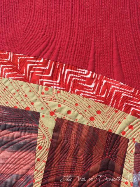
Marsala Mini back detail
I am pretty sure that this is my favorite mini I have done in this series, so I am really glad that I went out of my comfort zone to embrace marsala! What do you think of marsala? Are you making a project using marsala this year?
Quilt Stats
Title: Marsala Mini
Size: 13″x17″
Techniques: English paper piecing, machine appliqué, improvisational piecing
Quilting: Echo stitching done using a walking foot on a Bernina 1008
Fabrics: Kona in wine and charcoal; Alison Glass prints; Basketweave, Whisper, and a couple other prints from Riverwoods Collection by the Troy Corporation; Carolyn Friedlander Botanics print; several prints and batiks from unidentified fat quarters.
Batting: Warm and White Cotton Batting
Thread: Pieced with Gutermann Mara 100 color 245 (a warm clay/taupe color), Machine appliquéd with Gutermann Mara 100 in color 257 (a dark plum sort of color), Quilted with Connecting Threads Essential cotton thread in Red
Binding: Strips cut on the bias in 2″ widths, machine sewn to the front, hand sewn to the back
What was new:
Using English paper piecing techniques on irregularly curved shapes
Quilt 13 / 50
Goal #12 is Finished!
I’m linking this post up with Let’s Bee Social at Sew Fresh Quilts, Needle and Thread Thursday at My Quilt Infatuation, Fabric Tuesday at Quilt Story, Pet Project at Pink Doxies, Show Off Saturday at Sew Can She, and Sew Cute Tuesday at Blossom Heart Quilts. Please stop by to see all of the lovely work being created!